
You know the pause.
You have shared your screen, the grid of references is up, and the client is looking at it. Twelve images, neatly spaced, all of them right. And then: “Mm. Can we see some other directions?”
You had a direction. It was on the screen. They did not see it.
That is the moment a mood board presentation is won or lost, and it has less to do with the images than with the board they sit on.
The grid is doing the wrong job
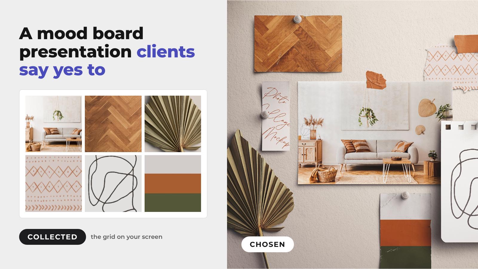
A grid of images says one thing, whether you mean it to or not. It says: here is what I collected.
That is the problem. Collecting is not the work. The work is everything you did after collecting, which is choosing. You looked at ninety images and kept twelve. You threw out the ones that pulled warm when the brand needed cool. You noticed two of them were fighting and cut one. That is hours of judgement, and a neat grid hides it, because a neat grid looks the same whether you spent four hours on it or four minutes.
Your client is not a designer. They cannot read a grid the way you do. What they can read is effort and intent, and a grid shows neither. So they do the only thing left to them and ask for more options. Now you are in round two of a conversation that should have ended in round one.
What changes when the board looks like an object

Put the same twelve images on a physical board. Paper, tape, a torn edge, a pin, a shadow where one card lifts slightly off the surface.
Nothing about your thinking has changed. Everything about how it reads has.
A board that looks like it sits on a desk tells the client a person stood at that desk and made decisions. Things were placed. Things were left out, because a board only holds so much and the client can see its edges. The composition makes an argument: this sits next to that, and it is deliberate. The overlap says one image leads and another supports. The empty space says I stopped here on purpose.
None of that is possible in a grid. A grid has no edges and no hierarchy. Every cell is the same size and the same distance from every other cell. It is a container, not a statement.
There is a second thing happening, and it is worth being honest about. A photographed board looks like finished work, not a first pass or a scratchpad. When clients see something that reads as considered, they respond to it as a proposal rather than a brainstorm, and they stop shopping for alternatives. That is not a trick. You did do the thinking. The board lets them see it.
Why the tools do not do this
Look at what is available for mood boards right now and the list is all software: Milanote, Figma and FigJam, Mural. All good at what they do, which is helping you gather and arrange things quickly while you think.
But they all hand you the same thing at the end: a grid on a screen. They are built for the collecting half of the job. None of them gives you a board that looks made by hand, because that would mean photographing real paper, real tape and real shadows, and software companies do not own studios.
That is the gap. Not a better arranging tool, but a finished board that looks like a thing rather than a screenshot.
Four mood board examples, four problems solved
Here are four problems a grid creates, and the board that fixes each one. All four come from the Moodboard Mockups range at $9, and each has a free version you can try first.
The grid has no edges
A torn sheet of cardboard has them. Tape one direction to it and the client sees exactly where it starts and where it stops.

Torn Cardboard Mockup with Tape, $9, or try the free version.
Every image is the same size
Overlap fixes that. One interior photo leads, a handwritten card and a sketch on a notepad page support it, and a dried palm leaf tells the client this happened on a real desk.

Photo Collage Mockup with Papers, $9, or try the free version.
It looks like a screenshot
Light does the work here. Sun falls across the wall, the papers curl at the corners, and a dried seed head sits beside the labels. Nobody mistakes it for a browser window.

Natural Mood Board Mockup, $9, or try the free version.
Three directions, no way to compare them
Pin them side by side. Three cards, the same size and in the same light. Here it is one logo on three colours, so the only thing that changes is the choice you want the client to make.

Mood Board Branding for Mockup, $9, or try the free version.
Building one

The workflow is short, which is the point. You have already done the hard part before you open the file.
1. Start with the board, not the images. Pick the surface first, because it sets the temperature of the whole thing. A torn cardboard layout reads editorial and a bit raw. A clean paper board on a neutral surface reads considered and premium. A board with pins and instant photos reads personal and warm. Choose the one that argues for your direction, then let the images sit inside it.
2. Drop your references into the smart objects. Every card, photo paper, notepad and envelope has a smart-object layer. Double-click it, place your image, save and close. The lighting and shadows sit on their own layers, so you can soften or strengthen them afterwards without touching your references.
3. Leave something out. This is the step people skip. If every slot is filled to the edge, you are back to a grid with a paper texture. Let one corner breathe. The gap is what makes the board read as a decision rather than an inventory.
4. Keep the shadows. They are what separate a board that looks photographed from one that looks assembled in a browser. Most people notice a wrong shadow before they could tell you what is wrong.
What is in the Mood Board Creator
Everything below was photographed in the studio and cut into pieces you can move.
- 34 elements: torn and kraft papers, cards, photo paper and photo strips, spiral notepads, envelopes, clips, masking tape, a bamboo ballpoint pen, and dried flowers and seed heads for the nature side of a board.
- Three mockups: a mood board on a cork board, a mood board on a grid wall, and an A4/A5 calendar with a weekly view.
- 5 backgrounds and 2 ready-made scenes, for when you want a finished board in minutes.
- Every object and its shadow on separate layers, colours you can change, and a background you can swap.
- Your design goes in through smart-object layers.
- 6000 × 4000 px at 300 DPI.
- PSD, Affinity Designer, Procreate and PNG files (1.52 GB), so it works in Photoshop, Affinity Designer and Procreate, and the PNGs drop into anything else.

It is $29, paid once. If you are a Custom Scene+ member, your credits cover it.
Where to start

If you present to clients regularly, Mood Board Creator is the one to get. It is a scene creator rather than a single fixed layout, so you build boards instead of filling in a template, and a designer running client work needs a different board most months.
If you have one project in front of you and want the finished thing today, take a single board from the Moodboard Mockups range at $9. It covers the surfaces worth having: paper boards, branding boards, torn cardboard, collage layouts, pinned instant photos and photos taped to a wall grid. Pick the surface that argues for your direction.
Not ready to buy yet? Most boards in the range have a free version in Free Files, including the Free Mood Board Layout and the Free Photos Mockup on Wall Grid. Download one, drop your references in and take it to your next client meeting. If it works, the Mood Board Creator is the same idea with everything on the table.
Every board in both is photographed. Real paper, real tape, real light. That is why the shadows sit right, and why the board reads as an object instead of a layout.
Your thinking was already good. This stops it getting lost on the way to the meeting.